2025
-
Suntory Beverage & Food Limited
Suntory Plus
Redesigning reward visibility to improve engagement in a corporate wellness app
Category
Mobile App / Retention
Role
UX Designer & Project Manager
Overview
Rebuilding the habit by making rewards visible
Suntory Plus is an employee health app that held 50%+ retention for years, until it began to slip. As the sole UX designer and project manager, I led a 8-week redesign of onboarding and the home screen to rebuild the habit.
Log analysis showed that users who reached the reward loop retained far better, but the feature was buried and its rules unclear. Under a tight year-end deadline, I chose to surface and explain the existing reward loop rather than add features: a prominent reward path on the redesigned home, onboarding coach marks that teach users how to earn rewards, and a stamp-card UI that makes the 3×/week rule obvious. I also aligned a mostly-new team on shared metrics before design began.
Contribution
UX audit
Information architecture
Home and stamp-card redesign
Team alignment on success metrics
Team
Product Owner
UX Designer / PjM - (Me)
2 UI Designers
3 Engineers
Timeline
8 weeks
Context
How the product is meant to work
Employees get Suntory Plus through their workplace as a health benefit: log small health actions and earn point-based rewards for staying consistent. The model hinges on one behavior repeating, completing tasks three times a week, until a habit forms.
That loop is also the weak point. When users drift from the rewards, little else pulls them back, and by the time I joined, that drift was already showing in the data.

Problem & Stakes
For a wellness app, sustained engagement is the product
If employees stop opening it, the client's investment, and contract renewal, are at risk. The declining retention curve wasn't cosmetic. It was existential.
My brief: break the stagnation and make the app form a habit on its own. There was also a hard constraint: the client needed to launch before year-end to capture a clean Week-8 retention read, leaving me about two months to design freeze. Speed was a fixed requirement, not a nice-to-have.

Strategy & Decision
Don't add features. Fix the core loop.
I started from data, not assumptions. Log analysis surfaced a clear lever: users who earned the 3×/week reward retained far better, and users who stayed active through their first eight weeks rarely churned afterward. That made Week-8 retention the metric to move, the point where the habit sets, and it tracked closely with reward acquisition.
So the real question wasn't "what feature do we add?" but "why aren't more users reaching a loop that already works?" A UX audit found two root causes.


Team Alignment
Leading a new team to one direction
The team was mostly new, with no shared definition of success. Before touching the IA, I ran an alignment workshop to lock down one product vision and the metrics we'd measure against, so the redesign had an agreed direction from the start.
I then worked in two roles. As project manager, I owned the schedule and facilitated the meetings that kept PO, engineering, and design in sync. As UX lead, I set the direction, made the core interaction decisions, and directed two UI designers through design reviews.
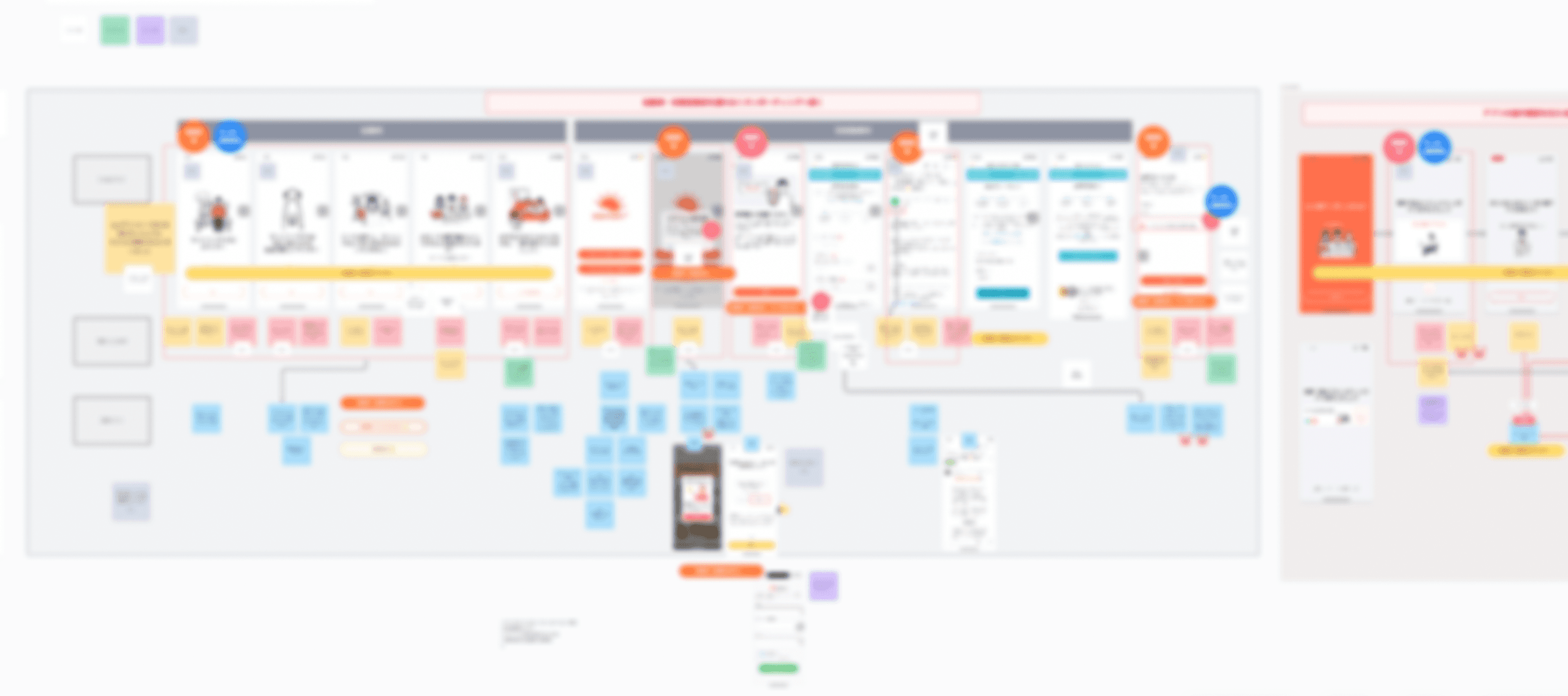
Wireframing
Exploring a visual model for weekly progress
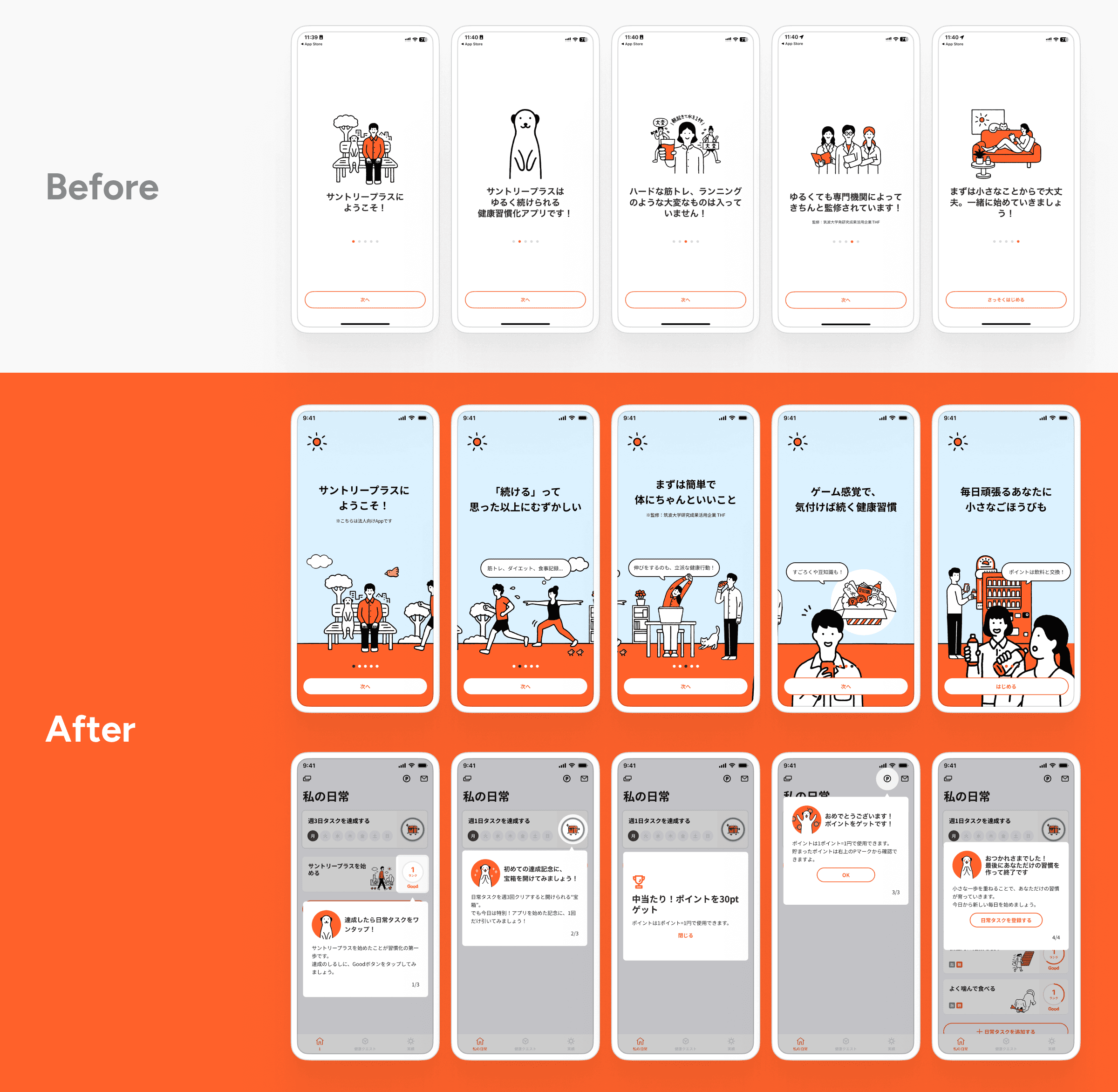
During wireframing, the main design challenge was to communicate the “three times per week” rule without relying heavily on explanatory text.
I explored a stamp-card pattern because it made weekly progress feel concrete, familiar, and easy to scan. This allowed users to understand their current status at a glance, even before reading the details.


Final Design
Turning weekly progress into a visible habit loop
The final design brings weekly progress, remaining tasks, and reward status into one visible area on the home screen.
By using a stamp-card format, the interface translates a complex reward rule into a simple visual habit loop: complete an action, earn a stamp, see progress, and move closer to a reward.
This helped users understand what to do next and made continued engagement feel more achievable.

Results
Measurable improvement in reward engagement and retention
After the redesign, users were more likely to earn weekly rewards and continue using the app over time.
The reward acquisition rate increased by 12%, suggesting that more users understood and completed the weekly reward flow. Week 8 retention also improved by 6%, indicating a positive impact on continued engagement.
16→28%
Reward Acquisition Rate
45→51%
Week-8 Retention Rate

Reflection
Making a high-confidence call under a real deadline
The biggest lesson was leverage: one well-surfaced core loop beat any amount of new feature work, and aligning the team on shared metrics early saved weeks of rework.
Under the deadline, I made a deliberate call: ship to capture the Week-8 retention window rather than spend the runway on pre-launch testing, keeping the bet defensible through log analysis and prior data. With more time I'd front-load lightweight usability testing, but the skill this project sharpened was making a high-confidence call under a real deadline, clear-eyed about the tradeoff.


